If you’re going to do something, do it properly, right?
I found myself reflecting on this worthy little rule of thumb a while back when, pre-lockdown, I was inspecting the lamp posts – or lighting columns if you are being posh – on the Victoria Embankment (as you do). And what I saw spurred me to write the following piece, although it has taken me 18 months to do so – even I recognise that lamp post pedantry has a time and a place and a major pandemic presents more pressing priorities.
Anyway, before I get to my rant, some scene-setting is in order.
Along the Victoria Embankment, from the Palace of Westminster to Blackfriars is a series of ornate lamp posts which will be of interest to fans of London local government.
To be clear, I am not talking about the Metropolitan Board of Works’ iconic lamps which grace the water’s edge: think big fish wrapping themselves around each lamp post, and large globe lanterns atop. That’s a whole other story which has surely been told elsewhere.
My focus is on the road itself and the 34 lighting columns which run down either side of it. They are big, bulky objects, ordered in opposing pairs as they once supported catenary lighting, suspended from wires that ran between each pairing.
Well, they started as 34, and 28 of them could be found between Westminster and Hungerford Bridges. The remaining six – interspersed with some replicas – were placed between Hungerford Bridge and the boundary of Westminster and the City, just beyond Temple Underground station.
The original set were judged to be of sufficient merit to earn a Grade II listing in 2008. To quote the listing:
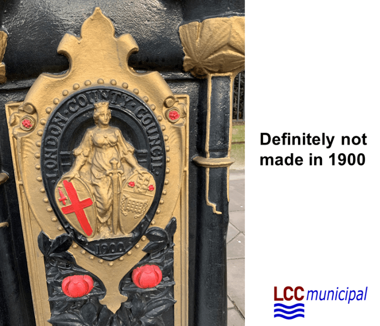
“The handsome posts have a unique design which comprises a rectangular base with four decorated panels topped with four dolphins whose tails appear to support the shaft of the post. The panel of the rectangular bases facing the road is enlivened by the date ‘1900’ and an image of a female figure, presumably Britannia, holding two shields, bearing the arms of the cities of London and Westminster; the panel facing the pavement contains a florid, Art-Nouveau influenced design of a flowering rose tree which dissolves into a ribbon frieze at the base; the two remaining panels contain a foliage design which includes an oak sprig and acorns. The shaft is topped by a finial and the post carries a light shade which dates from the second half of the C20 and is not of special interest. The lamps are painted black, gold and red.” [1]
I’ll come back to that “black, gold and red” later…
32 of the columns were produced by Walter MacFarlane & Co of the Saracen Foundry, Glasgow. These are the ones that date from 1900. The final two, near the Westminster Bridge junction, are by the Carron Company of Stirlingshire and are dated 1929. Although the listing reference above doesn’t mention it, these two bear a London County Council crest, introduced after the original lamp posts had been commissioned, but prior to the manufacture of these last two.
Until recently, these lights gave way at Temple to a far more modern installation, planted by the City of London in the 1960s – sleek contemporary lamp posts running down the central reservation, each with a shallow dish-like GEC lantern (UFOs on sticks, familiar to anyone who recalls London Bridge, London Wall and the environs of St Pauls in the 1970s and 80s). For those in the know, the change between the old and the new was a signifier that you had switched cities.
And that was that until Transport for London took over the whole of the road.
Minor outrage number one
In an act of harmonisation and imposed uniformity, guaranteed to anger those who celebrate London’s capacity for nuance and difference, Transport for London ripped up the City of London’s modern central reservation poles and replaced them with yet more replicas of the original 34 lighting columns from the Westminster side of the boundary.

Thus something authentic – modern street furniture from the late 1960s – was replaced with manufactured heritage. A subtle marker of the boundary change from Westminster to the City was also lost, with only a shield-carrying silver dragon left as an obvious sign of delineation.
It was a 1992 Jonathan Glancey article in the Independent that railed against the City of Westminster’s and Crown Commissioner’s Disneyfication of Regent Street which really rammed home to me the blight of faux heritage street furniture. In the case of Regent Street, the authentic – Frank Pick’s bus shelters, David Mellor’s traffic lights and the last examples of the fluorescent tubes which lit Westminster’s streets from the 1950s onwards – was swept away in favour of fake Regency reinventions of all these functional items. As Glancey put it:
“The new bus shelters – chunky, glazed arcades with vaulted roofs held up by bastardised fluted Roman Doric columns – are massive, devouring vast areas of pavement and looking as if they have escaped from a Hollywood film set c.1935 purporting to depict London c 1900.” [2]
After reading that article, I couldn’t help noticing the trend everywhere. Much of Britain’s post-war street furniture was time-expired by the early 1990s. As the 1950s concrete lamp posts (so hated by Nairn and Betjeman) were torn down, context-defying Victoriana started to spring up everywhere. An opportunity to introduce good, modern design was lost to dodgy mass-produced nostalgia. What 1930s streamline moderne parade of shops couldn’t be improved by a set of fake Victorian gas lamps? Well, that seemed to be the mantra anyway.
So, even though I loved the original 34 Victoria Embankment lighting columns, I felt an instinctive irritation at the imposition of more of them en route to Blackfriars.
Minor outrage number two
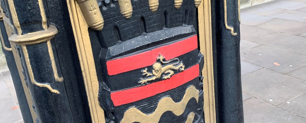
The replicas are a mishmash of the 1900 design bearing the putative Britannia and the 1929 LCC crest version. What I hadn’t noticed until I undertook my inspection of January 2020 was the paint scheme applied to them.
We all know how to paint an LCC crest, don’t we? Gold for the castellated crown, red and white for the cross of St George, gold for the lion that sits upon it and blue and white (possibly silver) for the wavy lines beneath that represent the Thames.
This level of detailing has escaped TFL’s painting contractors. Limited to a colour palette comprising only black, gold and red, the cross of St George becomes a reimagined flag of Austria (the lines of the cross, which are on the casting, are completely ignored) and the representation of the Thames is rendered in black and gold. This dingy colour scheme may be far more representative of the Thames as we know it, but that rather misses the point.

So, we are left with fake replica heritage covered in an incorrect paint job – the worst of both worlds. Yet the don’t-touch-the-statues blowhards are unlikely to get vexed about this: we seem to value the vague reassurance of historical imagery and heritage knick-knacks without caring much for their precise accuracy.
And while we are at it, here is another minor outrage
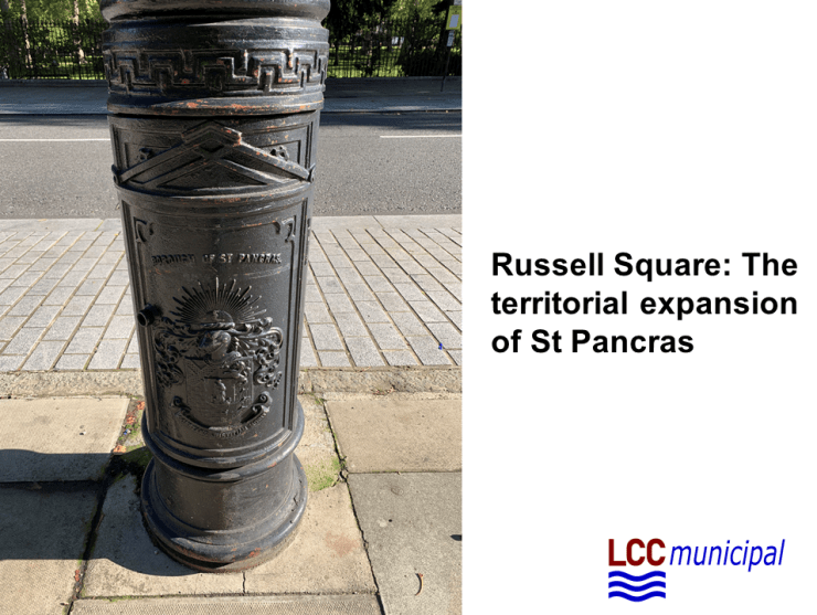
Which brings me on to Russell Square, a Bermuda Triangle (Square?) of municipal (in)authenticity.
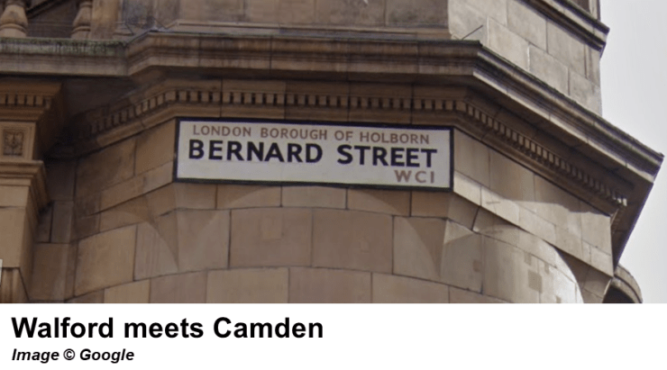
Leaving aside the fact that this is home to a “London Borough of Holborn” street sign, a fictional entity on a par with Walford, the Square is now lined by some gargantuan replica lamp posts which are adorned with the crest of the former Metropolitan Borough of St Pancras. Yet, prior to 1965, the Square was wholly within the Metropolitan Borough of Holborn (as the cack-handed attempt at labelling Bernard Street suggests).
“Why can’t people get this stuff right?” I heard my inner voice screaming. No answer was forthcoming.
So what?
Does any of this matter? Well, yes and no. It might seem churlish to moan about the lighting columns of the Victoria Embankment when the removal of the central reservation and the redesign of the road has resulted in a much improved urban environment and a far more efficient cycle-friendly space. But I am going to draw a line at Russell Square, once a somewhat seedy and louche place I rather loved, which has now been scrubbed and cleaned to within an inch of its life. The sanitisation of the space and its gentrification-by-numbers approach has resulted in a – doubtless well-intentioned – blunder which grossly misrepresents its municipal history.
The lighting columns of the Victoria Embankment can easily be repainted (although they probably won’t be), but we are stuck with St Pancras’s posthumous territorial incursions into Holborn.
Please do share with me on twitter any other examples of fake municipal heritage gone rogue. I enjoy being outraged on social media as much as everyone else…
Notes
[1] Listing details for the original 34 lighting columns: https://historicengland.org.uk/listing/the-list/list-entry/1392513
[2] “Gor blimey, guv, all it needs is muffin men and sweeps: Jonathan Glancey takes offence at the Classical traffic lights, bus shelters and other ‘street furniture’ popping up along Regent Street”, Jonathan Glancey, The Independent, 13 October 1992

You must be logged in to post a comment.