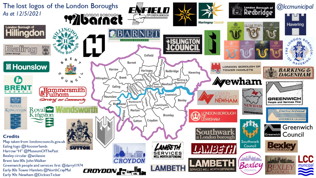
One regular work-in-progress that I trot out every now and again on twitter is the “lost logos of the London Boroughs”, a visual compendium of moribund local authority branding. This anorak activity provokes a range of responses – from warm feelings of nostalgia, through to outrage at the idea that local authorities should spend a single penny of Council Tax-payers money on any form of marketing. Endless rebranding might not be a sensible use of scarce public funds, but I think local government has an obligation to make itself user-friendly and accessible to the communities it serves. A clear, strong visual identity is an important component in achieving this. Personally, I am also interested in what these logos mean to people and how they help to build a sense of local identity.
This post looks at how the branding of London’s local authorities has changed over time.
In 1965, the 32 London Boroughs replaced an array of local government arrangements: the Metropolitan Boroughs within the London County Council area, the rather grand County Boroughs of Croydon, East Ham and West Ham and a large number of Municipal Boroughs and Urban District Councils in Middlesex, and those parts of Surrey, Kent, Essex and Hertfordshire that were absorbed into Greater London. As far as I am aware (and I would be extremely grateful to receive evidence to the contrary), none of the departing authorities had particularly ventured into the realm of visual identity beyond the use of their coat of arms allied with various inconsistently-used typefaces.

Without any precedent for formal branding, most of the London Boroughs used their newly granted coats of arms as their primary visual identity. There was a formality and authority about a council crest that doubtless gave a sense of confidence to the fledgling Boroughs and of reassurance to their ratepayers. It’s a theme I will return to later.

Some of the new Boroughs had different ideas though. They broke with tradition and saw the new chapter in London’s local government as an opportunity to bring in the designers.
The progressive pioneers were Camden and Hackney. The former opted for a linking hands design by Main Wolff & Partners to suggest “voting, giving, receiving and unity” (1). The latter went for a stylised “H” designed by Alec Davis. Tellingly, both logos survive in 2018 and are sufficiently iconic that their future is probably secure. Indeed, when Nike decided they were going to “borrow” the Hackney H for a sportswear design the Council initiated legal proceedings and won (2).

The new designs weren’t necessarily loved. As Anna Lowe notes, Geoffrey Finsberg, a local Camden Tory councillor (and later MP for the Borough’s Hampstead constituency), objected to his Council’s logo: “It’s a monstrosity. We are proud of this borough but we can’t be proud of a symbol like this” (3).
Designer-led visual identity took a bit longer to establish itself in the other London Boroughs, but gradually some new designs appeared in the late sixties and early seventies, from the simple to the striking. The boldest, perhaps, was John and Sylvia Reid’s electric flash symbol for Haringey, representing the history of television transmission from Alexandra Palace. The Newham “N” and the Havering “H” would follow.

With a wave of “new urban left” inner London Labour authorities emerging in the early 1980s, the next obvious evolution of the logo appeared: the tag line. Although ostensibly clear and empowered statements of intent around the commitment to, and delivery of, public services, opposition parties typically saw them as excessively politicised. For example, in response to Greenwich’s “People and Services First” a local Liberal councillor, David Woodhead, opined: “The logo is aesthetically displeasing and politically suspect”, adding that he also disapproved of the predominantly red colour scheme! (4). More overtly political though was Lambeth’s “Services Well Worth Defending” at a time of open conflict between the Thatcher government and numerous Labour authorities across the country.

By the mid-1980s, most, though not all, of the London Councils had stopped using the coat of arms in a marketing capacity. Logos were the norm and a few recurring motifs became common currency. Several outer London Boroughs chose to emphasise their green belt proximity. Sutton, Ealing and Barnet all went for a tree-based theme, following early adopter Waltham Forest, although Barnet also chose to add a representation of the M1, somewhat undermining the green ideal. Hand-holding in a display of civic cohesion was another theme favoured by Hillingdon, Southwark and, in a clever variation of its previous crown identity, Lewisham. The wider geographical and political context was acknowledged by Enfield and Newham, with both including a representation of the Greater London administrative area. Wandsworth, Croydon and Bexley experimented with abstractions of their suburban skylines.


The “noughties” saw a proliferation of wavy lines: Hammersmith and Fulham, Newham, Barking and Dagenham, and, more recently, Greenwich. In a number of cases, the lines are a vague reference to the River Thames. However, to my mind they represent the visual language of customer service and the call centre: soft, unthreatening and approachable (not a bad thing, of course). But they don’t set the pulse racing from a design perspective. They could just as readily adorn the websites and stationery of utilities, insurance providers or payday loan companies. The Newham “N” of the seventies and eighties was sharp, spiky and uncompromising. Its replacement is gentle and wafts its way across the page.
But at least the wavy lines still carry a degree of imagination. Recent years have seen a return to where we started, with the re-emergence of the coat of arms. Hillingdon, Bexley, Kingston-upon-Thames, Havering, Islington and Hounslow have all dropped their logos in favour of a return to tradition. Why is this?
A preference for Conservative administrations to go with, well, conservative imagery? Perhaps, but that doesn’t explain Islington or Hounslow. Personally, I feel it represents a nostalgic nod to the past and the solidity of the “Corporation” – a visual compensation for sustained budget cuts and erosion of power.
Yet this nostalgia is not true of everyone. Brent has only recently dropped the coat of arms in favour of…. I’m not too sure, but long live boldness. Developed by the Council’s in-house design team for a bargain £2,000 (5), the Council Tax payers of Brent can have no complaint on cost grounds. Residents of Haringey found their Council’s decision to spend £86,000 on a new logo rather more controversial. The logo, as well as the resultant furore, could have been borrowed from the London 2012 Olympics. The Evening Standard found Tottenham Hale resident Martin Bell claiming that “…it’s disgusting for the council to waste money on branding at a time when it’s cutting vital services for vulnerable people” adding that “the logo looks like it was made by a child with a marker pen.” (6) I have some sympathy for both Martin Bell and poor Haringey – the logo is infantile and far inferior to the Reids’ electric flash design, but the broader branding approach, with its striking use of Spurs-unfriendly red, does deliver on the need to make council services readily identifiable and accessible.
While there is a serious point around how Councils engage with their communities and how they build a sense of local identity, all this is a bit trivial compared with the issues that hard working local government officials and elected representatives must contend with on a daily basis. The “lost logos of the London Boroughs” therefore remains a bit of fun and stands as my somewhat indirect tribute to all those who have served the London Boroughs over the past fifty plus years.
Notes
(1) Anna Lowe, “The Camden Logo”, Camden 50 website (25 March 2015)
(2) Mark Tran, “Hackney wins logo case against Nike”, The Guardian (11 September 2006)
(3) Anna Lowe, as per note (1)
(4) “Council’s change in logo and motto is under attack” author and source unknown, with thanks to @darryl1974
(5) Max Walters, “Brent Council changes its logo for the first time in 40 years”, Brent & Kilburn Times (7 June 2012)
(6) Joseph Watts, “Cash-strapped Haringey Council spent £86,000 on logo and rebranding”, Evening Standard (18 September 2015)

Leave a comment