
In my previous post, I gave a brief overview of the rise and fall of the Tower Hamlets Neighbourhood scheme, a short-lived initiative from an equally short-lived Liberal/Lib Dem administration in the late eighties and early nineties. Local branding and a sense of local identity – major pre-occupations of this site – were a key component of the political experiment.
So, what remains of them visually? Early in January 2017, I set out on a walk around the Borough to find out…
My journey started at Mile End, where four of the Neighbourhoods met. My goal was to get at least one piece of visual evidence of each of the seven Neighbourhoods. Not wishing to start with failure, I followed up on a lead – verified on Google Streetview – that a lime green Poplar Neighbourhood street sign existed on Tomlins Grove. Off I set from Mile End tube…
Sure enough, at the far end of Tomlins Grove was a near-perfect example of the Borough’s street signage from the era. Spirits were high! One down, six to go.
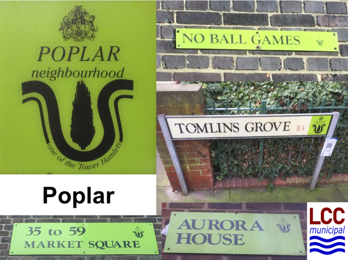
Back up to the Mile End Road and into the former Bow Neighbourhood. Around the Tredegar Square conservation area it was as if the Neighbourhoods had never ended. The smart Oxford Blue and Gold signage was much in evidence and has aged well. With many of the street signs affixed high up to private property, it cannot have been cost effective to embark on a mass replacement after 1994. In addition, signage for a local heritage trail had also adopted the Neighbourhood branding, resulting in much to photograph.

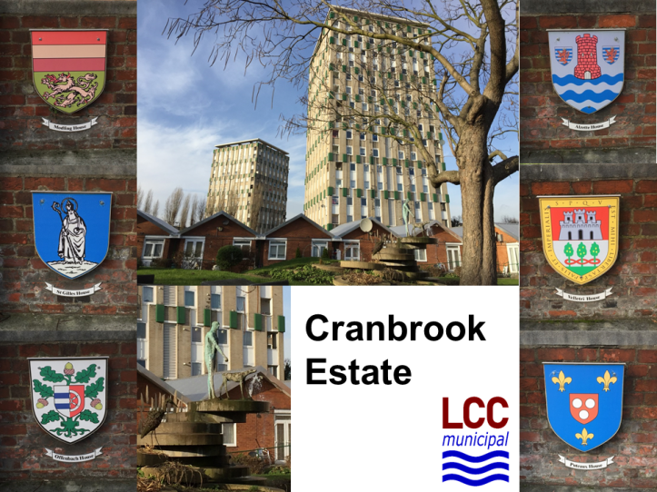
Off up Grove Road, alongside the Mile End Park and soon I was on Roman Road in the erstwhile Globe Town Neighbourhood. Globe Town had adopted white on black as its colours, but the only examples I managed to find were a reversed out version. To the north of Roman Road, of course, lies Lubetkin’s Cranbrook Estate. It was at this point – three Neighbourhoods in to my quest – that the slight ridiculousness of this mono-pursuit began to dawn on me. So, a chance to photograph Cranbrook and broaden the appeal of this piece beckoned! The ever excellent Municipal Dreams tells the story of Cranbrook far better than I ever could.
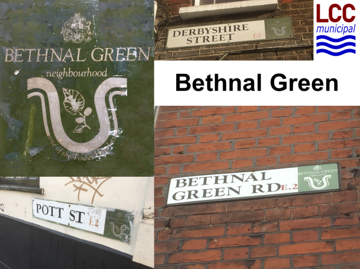
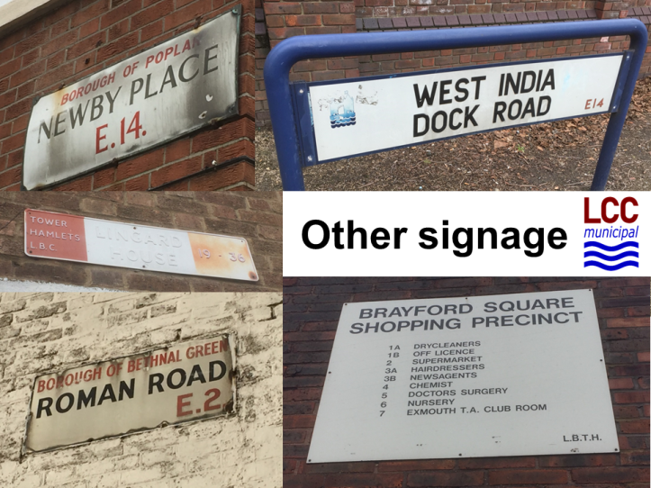
Then off to Bethnal Green, with that former Metropolitan Borough still represented on some of the Roman Road street signs. Bethnal Green Neighbourhood chose olive green as its colour scheme with a representation of mulberry tree leaves. Smugness was setting in now as I had decent field specimens from each of the four neighbourhoods I had visited. I set off across Weavers Fields and then down Vallance Road, a pleasant walk in the bright January sunshine.
The Royal London Hospital marked my entrance into the former Stepney Neighbourhood. Most of the street signs in the vicinity looked very old – it wasn’t that the Neighbourhood branding had gone, rather that it had never arrived in the first place. I did come across one instance round the back of the hospital, but it was so badly faded as to be unreadable. Stepney wasn’t looking promising. I weaved in and out of the side streets along the Commercial Road and finally stumbled across a fine example in Arbour Square. Stepney had adopted a pleasant purple scheme and a bell motif given its historical role in their manufacture.
Still keen to get to the Isle of Dogs, but with time running out, I was now on the hunt for a Wapping sign. A block of flats on the other side of the Commercial Road duly obliged and that had to be that. I really didn’t do justice to Wapping…
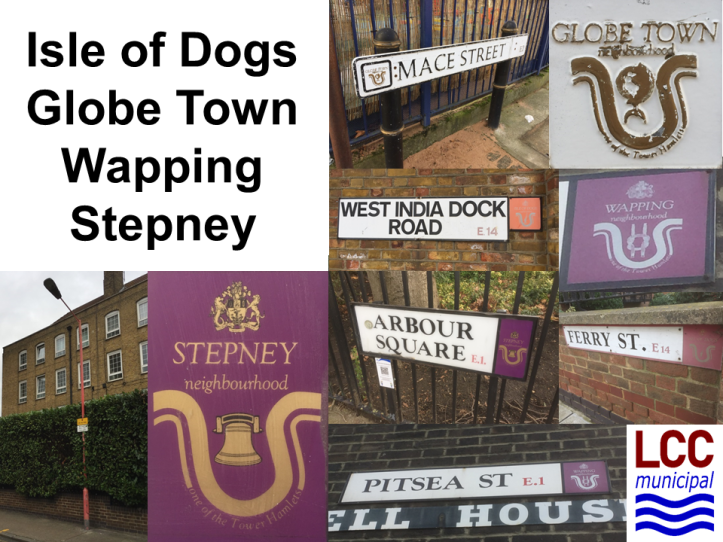
Then on to the Docklands Light Railway at Limehouse and a short trip to Crossharbour on the Isle of Dogs. This Neighbourhood had adopted a red colour scheme with a dockland crane as its chosen imagery, but the examples I found had – unsurprisingly – faded to a salmon pink in the intervening 30 years. Full house and job done!
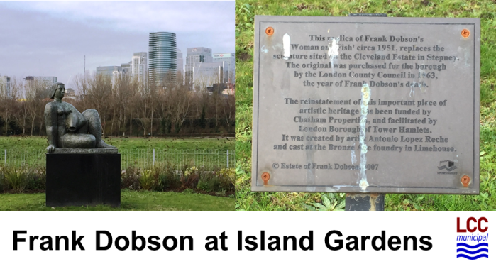
I shuddered to think of all the interesting stuff I had passed and casually ignored during my narrow-focused and blinkered expedition, so I sought to make amends on the last hour and a half of my journey. Island Gardens yielded the replica of Frank Dobson’s Woman and Fish, the original having been purchased by the London County Council in the sixties.
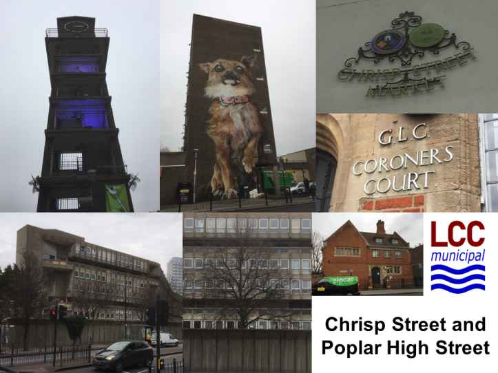
Then back on to the DLR and up to Westferry for a walk along Poplar High Street with some unexpected finds turning up. First, a reminder that the Neighbourhood colour schemes had extended to lamp-posts as I found some (now rare) red painted Isle of Dogs examples. Then some rather funky LDDC-branded signage with its Tower Bridge-inspired logo revealed itself at West India Dock Road. Shortly afterwards the GLC made an appearance at the Coroner’s Court on the High Street itself.
No trip to the area would be complete without paying homage to the Smithsons’ Robin Hood Gardens, now vacant and boarded up, and Frederick Gibberd’s Chrisp Street Market, originally built as part of the Festival of Britain. The contrast of the sad emptiness of the former with the vibrancy of the latter was profound. A bustling Chrisp Street Market was the high I ended on. What had started as a beautiful sunny morning was now a grey and overcast afternoon. It started tipping it down as if to signal the conclusion of my jaunt around Tower Hamlets.
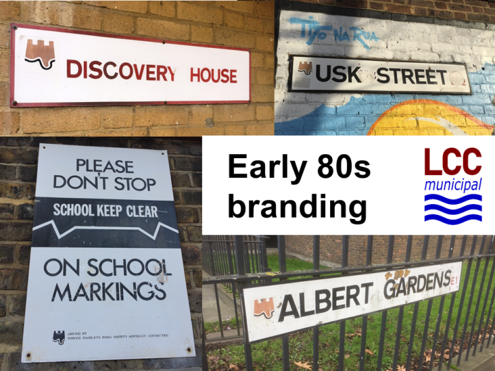
Regardless of how one might regard the Neighbourhoods experiment, it was pleasing to find so many examples of the branding surviving. A sensible and pragmatic move by the Council – no doubt constrained by budget – has resulted in this little bit of municipal history leaving its mark. Around Tredegar Square, that mark was still firmly imprinted, but elsewhere less so. One surprise was how much of the pre-Neighbourhood early eighties Council branding remained. It too used the distinctive curve of the Isle of Dogs, with a crude representation of a seaside sandcastle that has something in common with the Council’s current branding (perhaps the Tower of London has image rights that are beyond the means of the Council?).
So, all in all, a very pleasant start to the year. The physical exercise even accorded with my New Year’s resolutions to aim for greater fitness!

Fantastic field report!
Just wondering: would it be at all possible to give a rough idea of the boundaries of each neighbourhood? For example, it’s not quite clear where areas such as Whitechapel, Spitalfields, St Katharine Docks, Shadwell, Ratcliff, Limehouse and Mile End fit in.
(From previous wanders around Spitalfields/Brick Lane, I seem to remember seeing some Bethnal Green signage, and am guessing this might well also apply to Whitechapel; and I suppose St Katharine Docks, Shadwell and Ratcliff would fit into Wapping; Limehouse with Poplar would make sense; as for Mile End, you mentioned that it was the meeting point of four neighbourhoods: Stepney, Poplar, Bow and Globe Town?)
Incidentally, Globe Town – an area many people will have never heard of – seems an odd choice for an entire neighbourhood (rather than just being a component of Bethnal Green, say), especially when an important district such as Whitechapel was apparently deemed unworthy of a neighbourhood of its own. Was Globe Town chosen because it had a particularly high proportion of council-owned housing at that time? Or does/did the area simply have a particularly high population density?
In any case, many thanks for this photo report!
LikeLiked by 1 person
Many thanks for taking the time to read it and for your feedback. This link is external content, so I can’t take any responsibility for it, but it corresponds to my understanding of the boundaries http://www.election.demon.co.uk/thbc/neighbour.html Hope that helps!
LikeLike
P.S. Don’t know why Globe Town was chosen as a name. It was the smallest of the neighbourhoods (Lowndes and Stoker put the population at 15,000) and was therefore one of the smallest but most powerful units of local government in the UK (as L&S also note),
LikeLike
Globe Town is an old name, based on Globe Road. When the Lib Dems divided Tower Hamlets into neighbourhoods it was based on council wards, with the aim to divide into neighbourhoods with roughly the same number of councillors. Some of the neighbourhoods made pretty good sense in terms of community identity, but some – particularly Globe Town – were based more on expedience of numbers.
LikeLike